
INTERPRETING GRAPHS
Interpreting graphs is a critical part of statistics because most statistical findings are expressed in visual figures. There are a plethora of benefits to using graphs to display data. Obviously, a graph is condensed information that is simple to understand. Also, graphs illuminate trends in data, which is what most statisticians are looking for when conducting an observation or experiment. The most common graphs used in statistics are histograms, boxplots, and scatterplots. Furthermore, when analyzing these graphs the factors that are evaluated are shape, center, spread, and anything unusual.
Histogram
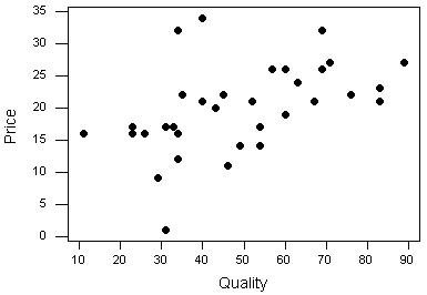
Scatterplot
Box and Whisker Plot
INFO: A histogram is a figure that groups data into ranges. It splits quantitative (numerical) data into increments, and indicates how many of the data entries fall under each increment. If all of the histogram bars are relatively the same height, statisticians would call that data set uniform. If the bars are higher on one side of the histogram, this data would be skewed left or right. Finally, if a data set looks relatively similar on both sides of the middle bar, the data is considered symmetric.
PROS: Histograms are especially illustrative in showing the shape of a data set. They are beneficial with large data sets because they can condense a wide range of numbers to clearly show a pattern.
CONS: One downfall of histograms is that they aren’t very specific in nature. One of the most common confusions of histograms is remembering that they only express a range of data rather than an exact number. When interpreting a histogram, it is important to remember that the y-axis is not another variable, but the frequency of a data entry falling within that range.
INFO: A box and whisker plot is similar to a histogram in the aspect that they group data into ranges. However, box plots are shaped by a data’s five number summary. A five number summary is like the skeleton of the data set, which contains the minimum, Q1, median, Q3, and maximum. Boxplots can also be characterized as uniform, skewed and symmetric like histograms, except these are indicated by the distance between each of quarters.
PROS: The five critical numbers are clearly marked on the box plot, which makes a box plot very useful for a quick summary of a data set.
CONS: Boxplots do not provide specific values aside from the five number summary. Furthermore, it is sometimes hard to determine patterns from box plots.
INFO: A scatterplot is a compilation of exact data points marked on the graph.
PROS: Because each point is expressed, a scatterplot is the most specific and accurate representation of a data set. Also, patterns can be seen in the scatter of points that would indicate trends in the data. A scatterplot is classified by whether it is random or has a pattern. . Furthermore, outliers are easier to see because each data point is clearly plotted.
CONS: However, do to their detailed and sometimes overwhelming nature, scatterplot patterns are sometimes hard to interpret.
Although graphs are a helpful tool in visualizing and understanding data, it is important to be aware of the ways they can be misinterpreted. For instance, a statistician could make the scale of a graph larger so that data would appear more stable and close than in reality. Also, they could leave out data or mislabel their graph. When you see a graph, think like the statistician in order to fully understand it. What is each axis representing? What is the scale of the graph? What is the graph expressing? Is this trend or shape realistic to that expression? With this informed mindset, you will be able to better understand the figures around you.


REAL LIFE APPLICATION


These two graphs actually represent the same data. The left one is what was used in the news report, and the right one is an accurate representation of the data. Pay close attention to the point on the far right, 8.6%. The creators of this graph actually plotted 8.6% in line with the previous point, 9%, in order to make the Unemployment Rate appear more steady. At quick glance while watching the news, one would barely notice this alteration. However, when compared with it's actual graph, it makes a very different impression. When you are analyzing graphs, make sure to pay close attention to the scale, and whether each point is properly placed according to that scale.
At first, you would say this is a bar graph. However, if you look closer, you will see that there is actually no statistical or graphical information at all! The creators of this graphic purposely made it look like a bar graph to make viewers think that there is some statistical importance. Really, it is saying almost nothing significant. The product has a higher itch relief than it's competitior after 1 minute and after 60 minutes, but there is no statistics to prove this. It is important to not let the image of the graphic fool you. Just because it looks like a bar graph, doesn't mean there is quantitative evidence behind it's message.
This graph is designed to make you think that the expenses of higher education has skyrocked past the earnings of higher education, thus meaning that higher education is losing value. However, the graph does not take other factors into acount that are necessary to draw this conclusion. While there the costs of higher education has increased throughout the years, the cost of not getting a college education have as well, so you would earn even less than salaries on this chart. Also, these salaries are annual, whereas education is providing you skills for your entire career. Overall, pay close attention to the titles of graphs in relation to the information given. If the graph attempts to justify a bold cause/effect statement like this one, make sure to take all factors into account before you believe the conclusion.